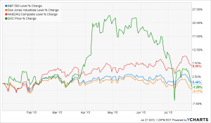
The following chart shows Chinese stocks in green (as represented by the S&P China SPDR, versus the S&P 500 (in blue), the Dow Jones Industrial Average (in orange) and the NASDAQ Composite (in red). As this graph illustrates, global stocks don’t necessarily move together on the way up, but they have a tendency to move together when prices drop. This chart also shows that Chinese stocks appear to be more volatile than domestic stocks. China’s government tends to manipulate the capital markets, causing these types of fluctuations. Right now, China’s stock market is swooning because its economy has slowed, and there is much fear that the government’s program to prop up the economy (and in a derivative sense, its stock market) is not as robust as it once was. This is a danger of investing in an emerging market in which the government plays an outsized role.
Labrador Investments | Cincinnati
Helping individual investors realize their financial dreams
Pages
- About Us
- Company Policies
- Customization of Your Accounts
- Ethics
- Individual Investors and Families
- Investing in Retirement
- Investment Philosophy
- Just for Women
- Our Clients
- Premier Investment Management Service
- Schwab Alliance Notice
- Schwab Alliance Notice
- Services
- Single and Periodic Investment Reviews
How to Reach Us
Labrador Investments
9826 Cincinnati Columbus Road
Cincinnati, OH 45241-1256
P: (937) 704-9400 F: (513) 777-3837
eisthencpa@gmail.comSchedule Your Appointment Today!
Please call our receptionist at (937) 704-9400, (Eisthen Associates, an associate of Labrador Investments)
Useful Links
 Powered by cloudIT
